DIGITAL CONSTRUCTION WEEK
Final Stand Designs
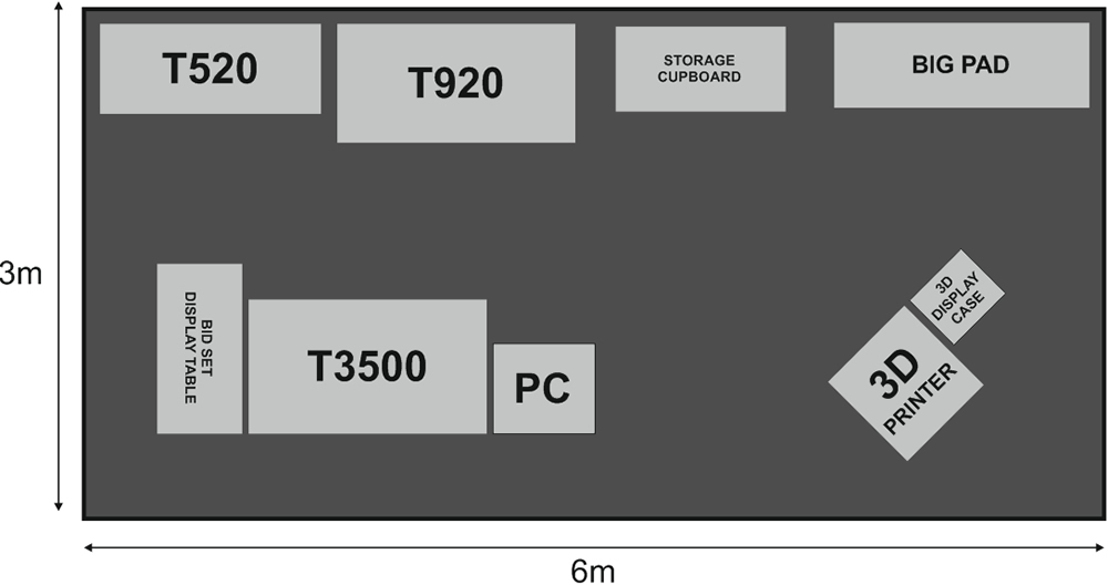
Final Stand Floor Plan
Stand Design Concepts
With the exception of the last, the stand designs below are mostly just half baked – they are not to be considered finished; they are concepts for your consideration ranging from the safe and obvious to the more outlandish and interesting.
Notes:
1) The 6m wide stand is a shell scheme and so the graphics will be interrupted by vertical metal dividers. Unless there’s a work around you know of?
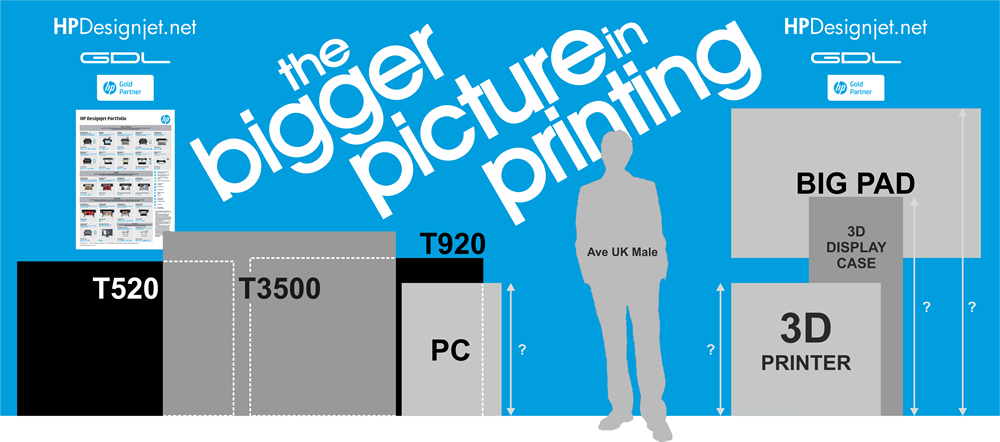
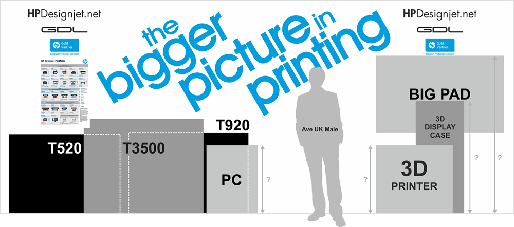
2) The drawings are to scale. I have “loosely” positioned the printers to illustrate how they will obscure the wall graphics.
OK, enough of that. Lets take a look. Scroll please..
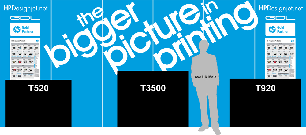
OPTION 1 – The BIG Blue
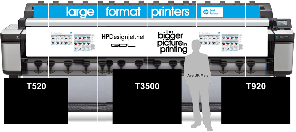
A wall of “HP blue”. Simple, striking, eye catching. We get the message across instantly with the use of the slogan “The Bigger Picture in Printing”. Coupled with the branding “HPDesignjet.net” and “HP Gold Partners” one would hope passers by assume we represent HP.
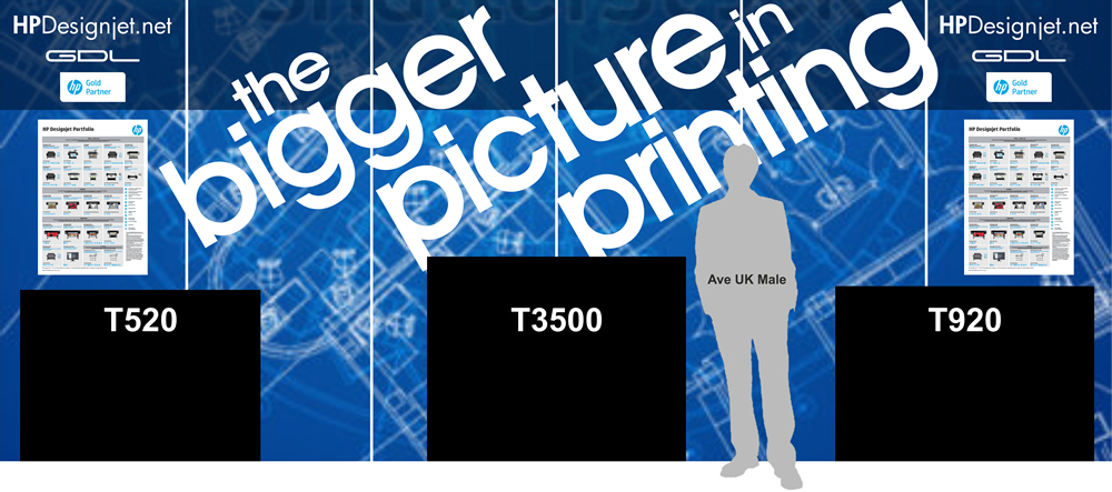
OPTION 2 – Blue Print
Similar to the above – with the addition of a blue print stock image (which will be crisp vector art). I regard this as an obvious/safe option. Although eye catching, I’m not sure architects need to be hit over the head with a graphic of a blue print. It does, however, instill the notion our stand is all about printing. You can argue the case either way. For me, it’s a little staid.
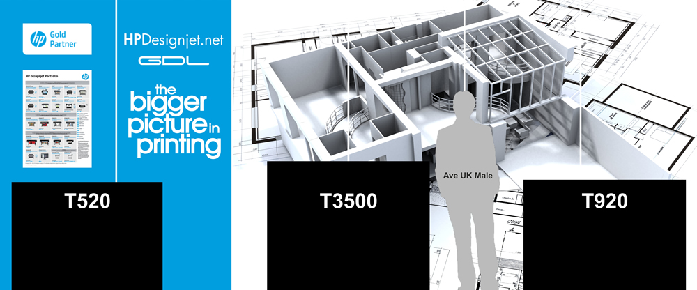
OPTION 3 – 3D Render
Again, a similar notion to that above – with the addition of 3D architectural artwork. Another obvious/safe option. Good use of “HP blue” for two panels.
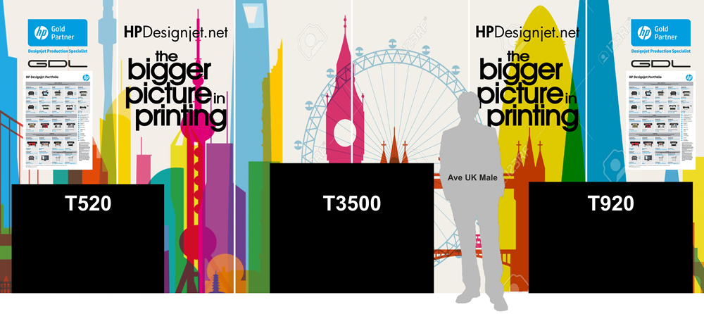
OPTION 4 – A Splash of Colour
An interesting montage of famous / iconic building in silhouette inspired (stolen from) Yoni Alter (click here). A departure from the ideas above – this injects colour into the stand and could become a talking point between visitors and the guys on the stand; which buildings / cities are represented? This idea is definitely half baked.
OPTION 5 – Monster Machine
So, it’s basically a HUGE photo of a Designjet T3500. Erm. There’s not much more to add really. But on a positive note(!), this design led to the final option.
OPTION 6 – Daaaa-DAAAAA!! D-D-D-DAHHH-Dah!
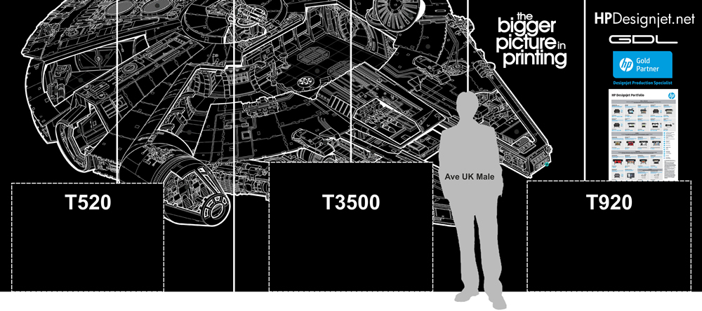
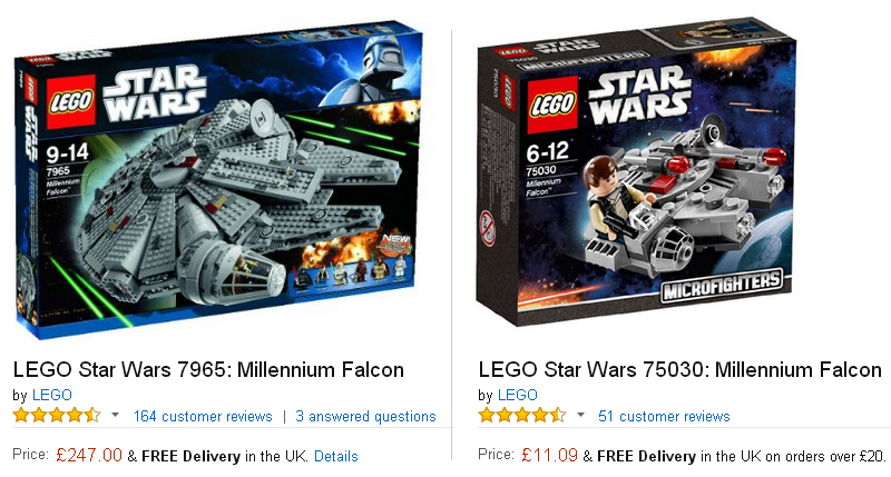
I had heard talk of using a Star Wars theme. I immediately started looking for schematics of Star Wars spacecraft – the most obvious of which was the Millennium Falcon. Using this imagery the stand design is certainly eye catching and would give us a “wow” factor. It works well with the “Bigger Picture in Printing” slogan and it has a connection to architects from being a line diagram. The only slight problem would be the clarity of the image – this needs work. The added bonus here is enjoying the zeitgeist and hype that’s building from the new Star Wars movie (release date Dec 18th). The aim would be to create intrigue and a buzz within the show… “Have you seen the Millennium Falcon stand?!” etc. We could also incorporate some kind of Star Wars Lego competition – two Lego boxes shown below..
Possible Prizes to be won..
OPTION 7 – My personal favourite
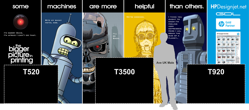
We’re all a bit tired of the usual run-of-the-mill “architect in a hard hat looking at a cad print” image, aren’t we? Well, this stand design is fun, carries a message and has great impact. And what architect doesn’t like robots?!
The shell scheme is split into 6 panels – which lends itself well to the 6 panel montage and is remarkably similar to a comic strip.
I’m hoping people will be drawn to the stand from curiosity and, after reading the robot quotes / chatting to the guys manning the stand, maybe even create a small buzz at the exhibition. An added bonus would be the connection of the terminator skull which will be added to the 3D print display.
The idea behind “some machines are more helpful than others” is intended to suggest they should upgrade their printer. For example, if customers ask the guys manning the stand, “so what’s with the robots?” – they can enter into a dialogue comparing the speed, efficiency, versatility of new vs old and how older machines can become problematic and so highlighting the shortcomings of dated hardware.
Above all my aim here was to design a stand that hasn’t been seen before (one that therefore stands out from all the others), attracts a crowd and gets people talking.

